
Apache Trinidad Skinning
About Skinning
A skin in Trinidad is a global style sheet that affects the entire application. You can create one skin for the entire application and as long as you have the <tr:document> tag on your page it will get picked up. Every component will automatically use the styling as described by the skin. Any changes to the skin will be picked up at runtime, no change to code is needed. Skins are based on the Cascading Style Sheet (CSS) specification.
With a custom skin you can change a component's default css styles, like color, font, background-images, you can change images that are rendered with <img> tags, you can change text using a resource bundle, and if the component allows you can change component properties, like showing the last breadcrumb or not for the entire application instead of having to set an attribute on every instance of the component.
Each component has skinning 'hooks'. The skinning hooks, aka keys or selectors, define what pieces of a component you can skin. There are also selectors that affect all the components, like a global background color or foreground color or a global font style.
A Skin's stylesheet is more than just a stylesheet that contains CSS styles. It can also contain images that get rendered as <img>tags in your page. You can create skin information for a particular agent or reading direction all in the stylesheet. All this gets automatically transformed into the appropriate CSS-2 page and rendered component (the icons you define in the skin stylesheet do not get output to the generated CSS-2 file, but instead get used by the renderer).
You can also dynamically switch skins during runtime, so you can create a skin with big fonts, a skin that is purple and pink, a skin that is blue and gold, and switch that depending upon locale or user or whatever you want.
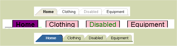
Put simply, with skinning you change the look of your application. Here is a visual example
of how you can change the look of the navigationPane hints='tabs' component. There are
three different looks for the tabs, and there are three different skins that provide these
looks; one is the out-of-the-box skin and the others are custom skins created for demo
purposes.
Create a skin - an overview
Let's get started and create a very simple skin so that you can see what files you need and where you need to put them. Later we'll go over more in depth features of skinning, like @agent support and icons vs styles vs properties.
This is what most people do when they work with skinning. This includes some tips and tricks:
- Create a skin
- Create a trinidad-skins.xml file and put it in your WEB-INF or META-INF of a jar file.
- Create a *.css stylesheet document that gets linked to your skin definition in trinidad-skins.xml
- Set trinidad-config.xml <skin-family> to be the skin-family of your skin.
- Turn off styleclass name compression in web.xml (while creating the skin only then turn it back on for performance sake)
- Install Firebug to help look at the DOM and the styleclasses
- Run a component or application to see the default mode. Your skin will extend the default skin, unless you specify otherwise (because you can extend any skin you want).
- Read the skin-selectors.html documentation for that component and also the :aliases (global selectors that affect more than one component, like text, background-color).
- Cross-reference the skin-selectors documentation with Firebug in case the renderer and the documentation have gotten out of sync (this shouldn't happen, and if it does, please log a JIRA-issue/bug)
- Decide what changes you want to make and add the Skin selectors/properties to your stylesheet.
- By default you'll need to restart your server to see your skin changes. To see your changes without restarting your server, set the web.xml parameter 'org.apache.myfaces.trinidad.CHECK_FILE_MODIFICATION' to true. However, you always need to restart the server to see skin property changes.
- Run your component to see the changes. NOTE: A frequently asked question is why don't I see my skin? The most frequently correct answer is that you forgot to add <tr:document> to your page. This kicks off the skin framework to create the skin's css file and link it to your page.
How to create a skin
To keep the first skin example simple, this section will explain what what files you need to create and change to create a bigfont skin. The bigfont skin does nothing more than change the default font for your application to be big, like 16px.
Create a trinidad-skins.xml file
Create a file in your WEB-INF directory and name it trinidad-skins.xml. Alternatively, you can create this file in the META-INF directory of your jar file and it will be found if that jar is on your application's classpath.
          <?xml version="1.0" encoding="ISO-8859-1"?>

            <skins xmlns="http://myfaces.apache.org/trinidad/skin">
                <skin>
                    <id>
                        bigfont.desktop
                    </id>
                    <family>
                        bigfont
                    </family>
                    <!-- if you want this skin to be for a pda, use org.apache.myfaces.trinidad.pda as the render-kit-id -->
                    <render-kit-id>
                        org.apache.myfaces.trinidad.desktop
                    </render-kit-id>
                    <style-sheet-name>
                        skins/bigfont/bigfont.css
                    </style-sheet-name>
            <!-- we are extending the default, simple skin, so no need for this
                    <extends>xyz</extends>
            -->
            <!-- no need for this in our bigfont skin
                    <bundle-name>
                        org.apache.myfaces.trinidaddemo.resource.SkinBundle
                    </bundle-name>
            -->
                </skin>
            ... more skins could go here ...
            </skins>
The trinidad-skins.xml file is where you define your skins.
Here are the attributes of a skin that you can define and their meaning:
- id - Each skin must have an id. This is a unique identifier for a skin. The syntax we use is bigfont.desktop. We put the .desktop in there to specify that this is for the desktop renderkit. You can also create a skin for the pda renderkit if you would like. family - Each skin must have a family. A skin belongs to a family and this is what you set in the trinidad-config.xml file under <skin-family>. Then the specific skin is chosen depending upon the renderkit that is being used on render. You can create a bigfont.pda skin that is also in the bigfont family. Then if a person is running your app with a pda, they would get the bigfont.pda skin. Otherwise, if you didn't have a bigfont.pda skin, they'd get the default skin which is simple.pda.
- render-kit-id - The renderkit that this skin is designed for. The values can be org.apache.myfaces.trinidad.desktop or org.apache.myfaces.trinidad.pda.
- style-sheet-name
- This is your skin's stylesheet name url.
We try a few different means to get the style-sheet-name file as an URL object.
First, we try to get an URL for the non static urls, that is, urls that could change
after the server has started:
- If style-sheet-name starts with "http:", "https:", "file:", "ftp:", or "jar:", then we create the URL by calling new java.net.URL(style-sheet-name).
- Else we create the URL by calling FacesContext's ExternalContext's getResource(style-sheet-name). (we prepend '/' if it isn't already there). This is how we find the style-sheet-name of the form "skins/bigfont/bigfont.css" when the file is in the application's project.
- extends - This is how you can extend another skin rather than the default simple skin. Say you like the purple skin but only want to change the font size. You'd extend the purple.desktop skin and change one selector in the css file to override the font size.
- bundle-name
- This is the package where the skin's resource bundle lives. Skinning text is not
recommended because you'll need to get the text translated for all the languages.
<bundle-name>org.apache.myfaces.trinidaddemo.resource.SkinBundle </bundle-name> - translation-source
- This is an EL binding that can point to a Map or a ResourceBundle. You can use this instead
of the bundle-name if you would like to be more dynamic in your skin translations at runtime. bundle-name takes precedence.
<translation-source>#{skinTranslationMap.contents}</translation-source>
Create your skin's stylesheet
In the previous step you created a trinidad-skins.xml which will create your skin. You also set the style-sheet-name to skins/bigfont/bigfont.css In your project directory, create the bigfont.css file to match the directory structure you specified in trinidad-skins.xml:
?- skins
?--- bigfont
?--?--- bigfont.css
We want to change the font to be bigger. Look in the skin-selectors.html doc for an appropriate selector to do this. Look for :alias selectors because aliases are 'global' and used in more than one component selectors. Thus alias selectors are a quick and easy way to change a style for your application rather than by each component selector.
Here are the font alias selectors.
.AFDefaultFontFamily:alias ? Specifies the default font family list ("font-family" property) for the skin. .AFDefaultFont:alias ? Specifies the default font for the skin. This style defines both the default font family (as specified by the AFDefaultFontFamily named style), the default font size, and default font weight.
In bigfont.css, to change the font for your application, do this:
.AFDefaultFontFamily:alias {font-family: Tahoma}
.AFDefaultFont:alias {font-size: 16px}
In trinidad-config.xml set the skin-family
Open the trinidad-config.xml file that is in your WEB-INF directory. Set <skin-family>bigfont</skin-family> This will set your skin to bigfont when you run your application. You can EL-bind the skin-family as well to dynamically change the skin at runtime.Remember, your page must have the <tr:document> tag on the page to kick off the skin framework.
Now you have created your bigfont skin. You can run your page and you will see that the font size and font family are now different than they were with the default simple.desktop skin.
Skinning a component - a step-by-step example
In the previous sections we discussed creating a skin that changes the font of your application. In this section, you'll learn how to skin an individual component. You'll need to read the skin-selectors documentation, and use tools like Firebug to figure out what to do when you have problems. The component we'll skin for this example is the panelBox component.
First, familiarize yourself with the component. Run it with styleclass compression disabled, and view it with Firefox so you can get a feel for its dom structure. Look at the skin-selectors documentation for the available public skinning keys. We recommend against using html elements in your skin selectors because the rendering could change. Sticking with public skinning keys will lessen the chance that your skin will have to change if the renderer changes.
From reading the documentation and viewing the panelBox component demo, you'll see that the panelBox has an attribute "background" that can be transparent, light, medium, dark. The panelBox's skin selectors are af|panelBox::transparent, af|panelBox::light, af|panelBox::medium, af|panelBox::dark when the background=transparent, light, medium, dark respectively. These selectors render on the root dom element as the documentation states.
You want to change the panelBox from the simple skin look to the purple look:
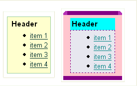
af|panelBox::medium af|panelBox::body {
  background-color: pink;
}
af|panelBox::medium af|panelBox::body {
  padding: 6px;
  background-color: pink;
}
af|panelBox::medium af|panelBox::header {
  background-color: Aqua;
}


/* for all panelBox headers, make the font bold */
af|panelBox::header {
  font-weight: bold;
  padding: 2px;
}
You see that the content part of the panelBox needs a different color background and a dashed border and maybe some padding. You add this to your css file:
af|panelBox::medium af|panelBox::content {
  background-color: #E7E4EA;
  border-color: purple;
  border-style: dashed;
  border-width:1px;
  padding-right: 6px;
  padding-left: 6px;
}
Now you need the borders around the sides of the panelBox and the curved top-left and top-right. You add this:
/* rounded corners on the top-start and top-end */
af|panelBox::medium af|panelBox::top-start,
af|panelBox::medium af|panelBox::top-end:rtl {
  background-image: url(/skins/purple/images/panelBoxStart.gif);
  width:8px;
  height:8px
}

af|panelBox::medium af|panelBox::top-end,
af|panelBox::medium af|panelBox::top-start:rtl {
  background-image: url(/skins/purple/images/panelBoxEnd.gif);
  height: 8px;
  width:  8px;
}

af|panelBox::medium af|panelBox::top {
  background-color: purple;
}

/* make the bottom have a background color and some padding, no rounded corners */
af|panelBox::medium  af|panelBox::bottom-start,
af|panelBox::medium af|panelBox::bottom-end,
af|panelBox::medium af|panelBox::bottom {
  background-color: purple;
  padding-top: 8px;
}

af|panelBox::medium af|panelBox::start,
af|panelBox::medium af|panelBox::end {
  background-color: pink;
}
Let's say for all panelBoxes other than medium, you want a background-color of yellow for the body. You can either do this:
af|panelBox::transparent af|panelBox::body,
af|panelBox::light af|panelBox::body,
af|panelBox::dark af|panelBox::body {
 background-color: yellow;
}
/* for all body, if doesn't have medium set, use yellow for the background-color */
/* The af|panelBox::medium af|panelBox::body {} definition above will take precedence over this alias
so the medium panelBox's body will be pink, not yellow */
.AFPanelBoxBody:alias {
 background-color: yellow;
}
Skinning Keys
This section is to help you understand the different kinds of skinning keys: component-level skinning keys, alias skinning keys, state skinning keys, skinning properties, and icon skinning keys. Other names for a skinning 'key' is skinning 'selector' or skinning 'hook'. This section will go over the skinning key syntax and their use. It is highly recommended that you familiarize yourself with the W3c's CSS specification regarding selectors, pseudo-elements and pseudo-classes. With this knowledge, skinning will be much easier.
Component-level skinning keys
This section will explain the syntax of a component-level skinning key and the pseudo-elements. In css, if you want to style a P element, you do the following:P {color: red }
Similarly, if you want to style the af:inputText component using a skin selector, you would do this:
af|inputText {color:red }
The pseudo-element syntax is used to style pieces of a component. From the css spec, here is an example of how to skin the first line of a 'p' element:
p::first-line { text-transform: uppercase }
The Trinidad components also have pieces to them, like label, content, start-top, etc, and they are skinned using the appropriate pseudo-element defined in the skin-selectors document. Here is an example of some of the pseudo-element skin selectors for inputText.
- af|inputText {...} - the entire component. renders on the root dom element
- af|inputText::label {} - the label
- af|inputText::content {} - the content (input element)
Alias skinning keys
Why do we need alias keys? Let's say you have a css-2 stylesheet for your page. You might define a bunch of style classes, and you might have font-style: Tahoma as your font-style of choice for all the style classes that are used for setting font. You might see a stylesheet like this:
    .AFInstructionText {font-family:Tahoma, Verdana, Helvetica, sans-serif;font-weight:normal;font-size:11px;color:#000000}
    .AFInstructionTextDisabled {font-family:Tahoma, Verdana, Helvetica, sans-serif;font-weight:normal;font-size:11px;color:#999999}
    .AFDataText {font-family:Tahoma, Verdana, Helvetica, sans-serif;font-size:11px;font-weight:bold;color:#000000}
    .AFDataTextDisabled {font-family:Tahoma, Verdana, Helvetica, sans-serif;font-size:11px;font-weight:bold;color:#999999}
If you want to change the font-family to Arial for everything, then you need to do a replace of every use of Tahoma to Arial. Well, in skinning you don't need to do this. You can use the :alias feature.
A skin selector that ends in :alias is one that never gets written out to the generated CSS-2 stylesheet. Instead it is included in other skin selectors and is useful in that you can change css properties in one place, not in tens or maybe hundreds of places. The base skin that you will extend has alias selectors that it includes in other skin selectors. One example is the .AFDarkBackgroundColor:alias. It defines a 'dark' background color, like blue. Then all the component selectors that use a blue background color include (with -tr-rule-ref: selector(".AFDarkBackgroundColor:alias");) this alias instead of 'color: blue'. Then a person skinning their application can change '.AFDarkBackgroundColor:alias' to another color and everywhere it is included will get changed. The alias feature is only useful to skinners if the component developers use the aliases instead of hardcoding things like colors and fonts.
Looking at the example above, to change the font-family:Tahoma to Arial you would have to change every style class that uses font-family. If, however, the base skin was defined to use the .AFDefaultFont:alias in these styles, you would only have to skin the .AFDefaultFont:alias in your skin.
Here's another example. The form components style their label the same. Let's say they all set the color to blue:
        af|inputText::label,
        af|inputChoice::label,
        af|selectOneChoice::label, etc. {color:blue}
        af|inputText::label,
        af|inputChoice::label,
        af|selectOneChoice::label, etc. {-tr-rule-ref: ".AFLabel:alias"}
        .AFLabel:alias { color: blue }
          In your CSS file you can change the color of all the labels like this:

          .AFLabel:alias {color: red}
State skinning keys
In CSS there are pseudo-classes, like :hover, :active, :focus. We consider these 'states' of the component. We use this same concept in skinning components. Components can have state, like read-only or disabled. We use the pseudo-class syntax to denote state in skinning selectors. For example, you can style the label when the component is disabled by writing this selector:
        af|inputText:disabled::label {color:gray}

        This generates:
        .af_inputText.p_AFDisabled .af_inputText::label {color:gray}

        It works on this html:

        <span class="af_inputText p_AFDisabled"><span class="af_inputText_label>Label</span></span>
Skinning properties
Skinning properties are skin css properties that are essentially a key that will be stored in the Skin object with the value. The renderer uses the skin property when it is rendering. The skin properties are documented in skin-selectors documentation. They are available for the skin to use as a way to customize the rendering of a component application-wide, not per-instance. per-instance customizations are component attributes.An example of a skin property is -tr-show-last-item for the navigationPath component. In your skin's css file you can specify whether you want the last item to be shown or not.
          /* For all instances of the navigationPath in the application, do not show the last item */
          af|navigationPath {-tr-show-last-item: false}
Icon skinning keys
Some components render icons (<img> tags) within them. For instance the inputDate has a launch icon. Chances are you will want to skin the icons. Even though these icons are not rendered with CSS, like background-image, they are still skinnable in the Skin CSS file.
All icon skin keys end with '-icon' or 'Icon:alias'. icons do not get generated to the CSS-2 stylesheet. Instead they get registered with the Skin object and the renderer uses the icon when it is rendering. It will use your skinned icon if you have skinned it. Otherwise, it will use the base skin's icon. Note that CSS-syntax like pseudo-classes (:hover, etc) and descendent selectors and composite class selectors do not work with icon selectors.
              af|inputDate::launch-icon {
                content:url(/skins/purple/images/dateButtonPurple.gif);
                width:19px;
                height:24px
              }
              af|inputDate::launch-icon:rtl {
                content:url(/skins/purple/images/dateButtonPurpleRTL.gif);
                width:19px;
                height:24px
              }
              /* You can use a 'text' icon instead of an image icon if bandwidth is a concern, for example */
              af|foo::help-icon {
                content: '?';
              }
Skinning Text
Text our components render is translatable. The text is abstracted out as resource bundle keys. With skinning you can override resource bundle key values. These key values should be documented in skin-selectors.xml, but if they are not (they are not currently for the Trinidad components), then you'll have to look at the CoreBundle.xrts/.java source file for the keys. The resource bundle key/values are not skinned in the skin's css file. Instead they are skinned in a Map or ResourceBundle and you point to that from your skin definition in trinidad-skins.xml.
Let's go through an example. Let's say you want to skin the ShowDetail disclosed tip. Let's say the 'key' is af_showDetail.DISCLOSED_TIP. You would:
- Create a ResouceBundle file that sets your new value for this key and any other keys you want to change the value for.
- Set bundle-name in the trinidad-skins.xml file for your custom skin.
      public class SkinBundle extends ListResourceBundle
      {
        @Override
        public Object[][] getContents()
        {
          return _CONTENTS;
        }

        static private final Object[][] _CONTENTS =
        {
          {"af_tableSelectMany.SELECT_COLUMN_HEADER", "Select A Lot"},
          {"af_tableSelectOne.SELECT_COLUMN_HEADER", "Select Just One"},
          {"af_showDetail.DISCLOSED_TIP", "Click to Hide"}
        };
      }
     <skin>
        <id>
            purple.desktop
        </id>
        <family>
            purple
        </family>
        <render-kit-id>
            org.apache.myfaces.trinidad.desktop
        </render-kit-id>
        <style-sheet-name>
            skins/purple/purpleSkin.css
        </style-sheet-name>
        <bundle-name>
            org.apache.myfaces.trinidaddemo.resource.SkinBundle
        </bundle-name>
    </skin>
Then when the renderer renders the text, it will look in your resource bundle first for the key's value. It is highly recommended if you do skin text that you provide all the translated bundles for the key you are skinning. Therefore you will have many other files, like SkinBundle_fr, etc., for each language.
Another option for skinning text is to use the translation-source parameter instead of bundle-name. translation-source is an EL binding that points to a Map or a ResourceBundle. The benefit of this option is that you can automatically change the translation value based on any logic that you want at runtime. bundle-name takes precedence if both are set.
public class SkinTranslationMapDemo
{
  /* Test a skin's translation-source EL pointing to a Map */
  public Map<String, String> getContents()
  {
    return _CONTENTS;
  }

  static private final Map<String, String> _CONTENTS = new HashMap<String, String>();
  static
  {
    _CONTENTS.put("af_inputDate.LAUNCH_PICKER_TIP", "Launch PickerMap");
    _CONTENTS.put("af_showDetail.DISCLOSED_TIP", "Hide Tip Map");
    _CONTENTS.put("af_showDetail.DISCLOSED", "Hide Map");

  }
}
      <skin>
        <id>
            purple.desktop
        </id>
        <family>
            purple
        </family>
        <render-kit-id>
            org.apache.myfaces.trinidad.desktop
        </render-kit-id>
        <style-sheet-name>
            skins/purple/purpleSkin.css
        </style-sheet-name>
        <translation-source>#{skinTranslationMap.resourceBundle}</translation-source>
    </skin>
Skinning CSS features
You can do things in a skin css file beyond what you can do in a regular css file. At runtime the skin framework processes the skin's css file and skin framework pulls out skinning properties and icons and registers them with the Skin object. The skinning framework merges styles together that use the -tr-rule-ref property. The skinning framework picks the styles based on the HTTP request information, like agent and platform and merges them with the non-specific styles. This section will go into more detail on these features and how you can use them in your skinning css file.
- Skin properties e.g., af|breadcrumbs{-tr-show-last-item:false}. Skin properties for a component are documented in the skin-selectors documentation. Skin properties are useful if you want to control the rendering of a component that css alone cannot do, like displaying the last item or not (well, css might be able to do that). The writer of the renderer may choose to expose skin properties to enable the application developer to have more control over the way the component renders without having to write their own renderer. Another example is af|train {-tr-visible-stop-count: 10}. This allows you to change the number of visible train stops.
- -tr-inhibit - > e.g., af|foo {-tr-inhibit: padding; color: red} This css property is used to inhibit/reset css properties that you are inheriting from a base skin. "-tr-inhibit: all" will clear out all the inherited properties. "-tr-inhibit: property-name " will inhibit the property name; "-tr-inhibit: padding", for example, will clear out any padding that you have inherited. You need to make sure your property-name matches that in the base skin. If the base skin has padding-right: 6px and you inhibit padding, you will still get the padding-right. You need to inhibit padding-right. Also note that inhibitions happen when the skinning framework processes the skin's css file, and not based on cascading rules in the browser. Therefore the skin selector has to match and the property name has to match exactly to what you are inhibiting.
- -tr-rule-ref - > This is used to include other styles in your style see :alias section. Application developers probably won't use this. This is meant for component developers to use when they are setting up the base skin for their components.
You might not want your selector's css properties to be applied to all browsers, all platforms, all locales, and both reading-directions. For example, you might have to tweak some padding in IE that you don't need on any other browser. You might want the font-style to be different on Windows than it is on other platforms. To style a selector for a particular user environment, you put that skinning information inside a skinning framework @rule or ':rtl' pseudo-class. The skinning framework picks the styles based on the HTTP request information, like agent and platform and merges them with the styles without rules. These css properties that match the 'rules' get merged with those outside of any 'rules'; the most specific rules that match a user's environment take precedence. (See an example in the css code below.) The skinning framework currently supports these 'rules':
- @platform {/skin definitions go here/} - > Possible values are: windows, macos, linux, solaris, ppc. This is to define styles only for a particular platform.
- @agent {/skin definitions go here/} - > Possible values are: netscape, ie, mozilla, gecko, webkit (maps to safari), ice. This is to define styles only for a particular agent. Agent type can be followed by a space separated list of version numbers. Several agents can be specified separated by commas.
- @accessibility-profile {/skin definitions go here/} - > Possible values are: high-contrast, large-fonts. This is to define styles only for a particular accessibility profile. See the Configuring Apache Trinidad chapter for information on setting the accessibility profile.
- :rtl - > pseudo-class to create a style or icon definition when the browser is in a right-to-left language. The best example is that of images that are not symmetric. If you set a skin selector that uses a asymmetrical image, when you set your browser to the right-to-left reading direction, then you want your image to be flipped. To do this, you use the :rtl pseudo-class at the end of your selector and point it to a flipped-looking image.
- :lang or @locale - > Not yet implemented in Trinidad.
        /** for ie and gecko on windows, linux and solaris, make the color pink **/
        @platform windows, linux, solaris
        {
          @agent ie, gecko
          {
            af|inputText::content {background-color:pink}
          }
        }

        af|someComponent {color: red; width: 10px; padding: 4px}

        /* for ie, we need to increase the width, so we override the width.
        We still want the color and padding; this gets merged in. We want to add height in IE.  */
        @agent ie
        {
          af|someComponent {width: 25px; height: 10px}
        }

        /* for ie 5 and 6, we also need some margins.*/
        @agent ie (version: 5) and (version: 6)
        {
          af|someComponent {margin: 5px;}
        }

        /* for Firefox 3 (gecko 1.9) use a smaller margin.*/
        @agent gecko (version: 1.9)
        {
          af|someComponent {margin: 4px;}
        }

        /* The following selectors are for all platforms and all browsers */

         /* rounded corners on the top-start and top-end */
         /* shows how to use :rtl mode pseudo-class. The start image in ltr mode is the same as the
         end image in the right-to-left mode */
        af|panelBox::medium af|panelBox::top-start,
        af|panelBox::medium af|panelBox::top-end:rtl {
          background-image: url(/skins/purple/images/panelBoxStart.gif);
          width:8px;
          height:8px
        }

        af|panelBox::medium af|panelBox::top-end,
        af|panelBox::medium af|panelBox::top-start:rtl {
          background-image: url(/skins/purple/images/panelBoxEnd.gif);
          height: 8px;
          width:  8px;
        }
        /* don't use the base skin's background-image */
        af|navigationPane::tabs-active af|navigationPane::tabs-bottom-start-content {
          -tr-inhibit: background-image;
        }
        /* this should end up with  .portlet-form-input-field {padding: 8px} */
        .portlet-form-input-field {
        /* This should first inhibit all inherited styles. Then everything else
           should be included.*/
          -tr-inhibit: all;
          padding: 8px;
          /* This should inhibit the background-color that is inherited and/or included,
          like in .AFLightAccentBackground:alias
          The order of this does not matter. */
          -tr-inhibit: background-color;
          -tr-rule-ref: selector(".AFLightAccentBackground:alias");
        }
Tips and Tricks
View uncompressed styleclass names
When you run a page and view the html source, you will see styleclasses like class="x10". To see instead something more meaningful like class="af_inputText_content" you need to disable the styleclass compression which is enabled by default for performance reasons. To disabled the compression, you need to add this to the web.xml file:
        <context-param>
         <param-name>org.apache.myfaces.trinidad.DISABLE_CONTENT_COMPRESSION</param-name>
         <param-value>true</param-value>
        </context-param>
Firebug
Install Firebug on Firefox. With this tool you'll be able to view the rendered components and the css properties of the various dom elements. This will help you figure out what skin selectors are causing the css styling. Alternately, you can view the rendered CSS file itself.
To map a rendered styleclass to a skin selector you'll need to look at the skin-selectors.html document.
          A skin selector like :

          "af|panelBox" gets generated as ".af_panelBox"

          "af|inputText:read-only::content" gets generated as ".af_inputText.p_AFReadOnly .af_inputText_content".

          Any non-css-2 pseudo-classes gets generated as .p_AF*, otherwise they pass through.

          "af|commandLink:hover" gets generated as ".af_commandLink:hover"
Simple (default) skin
To see what you get out of the box without any skinning on your part, you should run the simple skin, which is the default. You can use Firebug, or view the generated css file. Or, if you look have the source code, you can look at base-desktop.xss or simple-desktop.xss . These files are not public and are in in an xml-based format, not CSS, so it might be harder to understand. If you get some property from the base skin that you don't want, you can use the -tr-inhibit property:
af|foo {-tr-inhibit: all} to inhibit all the base skins' properties and start fresh.
or
af|foo {-tr-inhibit: padding} to inhibit the padding css property.
The property name has to match the base skin's property exactly, so looking at the base-deskop.xss will help.
W3C's CSS specification
You need to be very familiar with CSS to do complex skinning. Some useful concepts to know are the different types of selectors, like descendent selectors, composite class selectors, and selector specificity. You can look at the w3c's css spec for detailed information. Selector specificity is really important to understand, because you might get into a situation where you are not sure why your style is not getting picked up. It could very well be that the base skin has a selector that is more specific than your selector and thus the browser gives it more weight regardless of the position in the generated css file.
Using the styleClass attribute
You can skin a particular instance of a component by combining the skin selectors and the component's styleClass attribute value. For example, you can put a styleclass on the commandLink component and then skin it
          <tr:commandLink styleClass="myCommandLink">

          /* style any commandLink components that have their styleClass attribute set to 'myCommandLink' */
          af|commandLink.myCommandLink {color: red}
Skinning for Custom Component Developers
This section is for a custom component developer. This section is not for someone who is skinning their application.
If you created your own custom component, and you want this component to work well with other existing skins, then you need to create a skin-addition. A skin-addition gives you a way to 'push' your own stylesheet and resource bundle for your components into existing skins, most likely the simple skin. Then you can jar up your component and skin information and your component can be used by others. (Another way to do the same thing is to open up the simple-desktop.xss file and other skin css files, and add your skin definitions there. This is not practical if you don't own this source.)
Skin objects contain zero or more SkinAdditions. The SkinAdditions' stylesheets are merged into the Skin's own stylesheet. The SkinAdditions' resource bundle is looked at along with the Skin's own resource bundle when Skin's getTranslatedValue is called by your renderer.
Creating a skin addition declaratively
Create a skin stylesheet file (say, myComponents-simple-desktop.css) that defines your icons, styles, and properties so that your components will fit in with the simple.desktop skin (or whatever skin you want to fit in with). Use the Skin Selector Aliases as much as possible. This way if a person wants to change the default font for the entire application, he can create a skin that changes the .AFDefaultFont:alias and your component's font will change, too. If you didn't include the alias in your skin selector properties, then your font won't change. (See Skin-Selectors.html documentation)
Register this StyleSheet file with the simple.desktop skin. Create a META-INF/trinidad-skins.xml file if you don't already have one.
          <?xml version="1.0" encoding="ISO-8859-1"?>

            <skins xmlns="http://myfaces.apache.org/trinidad/skin">
                <skin-addition>
                    <skin-id>
                        simple.desktop
                    </skin-id>
                    <style-sheet-name>
                        styles/myComponents-simple-desktop.css
                    </style-sheet-name>
                    <bundle-name>
                        org.mycompany.view.resource.myComponentsResourceBundle.java
                    </bundle-name>
                </skin-addition>
            ... more skins or skin-additions could go here ...
            </skins>
- skin-id - The id of the skin you are 'pushing' your styles into.
- style-sheet-name - This is your skin's stylesheet name url. This should be a uniquely name path, since we use ClassLoader getResource to find this file, and if another jar has the same style-sheet-name, it might find that file and not yours.
- bundle-name - This is the package where the skin's resource bundle lives. This is important for a custom component developer so that the component's text supports different languages.
If you want your component to be skinnable, then you should document the selectors similar to the skin-selectors.html document we have in Trinidad.
Serving up your stylesheet's image urls
Feel free to jar this file up with your other files, because we can find trinidad-skins.xml files in the META-INF directory. However, we can't automatically find any image urls; so if you have image urls, like background-image: url("../arrow.png"); in your myComponents-simple-desktop.css file, you'll have to either put the images relative to the servlet context (start with a /), or create a ResourceLoader and make the path relative to the css file, like "../../xyz/images/drill.gif".
These are the steps to create your own ResourceLoader:
- Add an extra servlet-mapping to web.xml for your resource path, like "/xyz/*" as opposed to "/adf/*".
-
Create a ResourceLoader file, like org.mycompany.resource.XYZResourceLoader
package oracle.adfinternal.view.faces.xyz.resource; import org.apache.myfaces.trinidad.resource.ClassLoaderResourceLoader; import org.apache.myfaces.trinidad.resource.RegexResourceLoader; import org.apache.myfaces.trinidad.resource.ResourceLoader; public class XYZResourceLoader extends RegexResourceLoader { public XYZResourceLoader(ResourceLoader parent) { register("(/.*\\.(css\|jpg\|gif\|png\|jpeg\|js\|svg))", new ClassLoaderResourceLoader("META-INF", parent)); } } - Create a .resources file and place it in META-INF/servlet/resources. In the file, place a single line that references the resource loader class. For example, create an xyz.resources file with the following single line: org.mycompany.resource.XYZResourceLoader
- Place the .resources file in your JAR, so its path is META-INF/servlet/resources/xyz.resources.
- Add resources in your jar at the following location: META-INF/xyz/*, which needs to match the servlet-mapping
- Create a URL reference to the image with "xyz" in the path.
- all files created above should be in the same JAR that contains your custom components/faces-config.xml/etc.