
Examples of Programming the iPhone Native Look and Feel
This example describes the following components for iPhone:
Although you manually apply most of the CSS classes to specific components using the styleClass attribute, some CSS features are applied by default when you use the iPhone skin.
Header
This section describes the style classes used for building a header component.
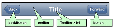
Header Style Classes
Toolbar
      .toolbar {
        box-sizing: border-box !important;
        -webkit-box-sizing: border-box !important;
        -moz-box-sizing: border-box !important;
        border-bottom: 1px solid #2d3642 !important;
        border-top: 1px solid #000000 !important;
        padding: 10px !important;
        height: 45px !important;
        background: url(/images/toolbar.png) #6d84a2 repeat-x !important;
        display: block !important;
       }

      Toolbar Title
      .toolbar > h1 {
        position: absolute !important;
        overflow: hidden !important;
        left: 50% !important;
        margin: 1px 0 0 -75px !important;
        height: 45px !important;
        font-size: 20px !important;
        width: 150px !important;
        font-weight: bold !important;
        text-shadow: rgba(0, 0, 0, 0.4) 0px -1px 0 !important;
        text-align: center !important;
        text-overflow: ellipsis !important;
        white-space: nowrap !important;
        color: #FFFFFF !important;
        border-bottom: none !important;
      }

      button
      .button {
        position: absolute !important;
        overflow: hidden !important;
        top: 8px !important;
        right: 6px !important;
        margin: 0 !important;
        border-width: 0 5px !important;
        padding: 0 3px !important;
        width: auto !important;
        height: 30px !important;
        line-height: 30px !important;
        font-family: inherit !important;
        font-size: 12px !important;
        font-weight: bold !important;
        color: #FFFFFF !important;
        text-shadow: rgba(0, 0, 0, 0.6) 0px -1px 0 !important;
        text-overflow: ellipsis !important;
        text-decoration: none !important;
        white-space: nowrap !important;
        background: none !important;
        -webkit-border-image: url(/images/toolButton.png) 0 5 0 5 !important;
        Examples of Programming the iPhone Native Look and Feel
        Beta Draft Skinning Support 4-7
      }

      backButton
      .backButton {
        position: absolute !important;
        overflow: hidden !important;
        top: 8px !important;
        left: 6px !important;
        margin: 0 !important;
        height: 30px !important;
        max-width: 45px !important;
        line-height: 30px !important;
        font-family: inherit !important;
        font-size: 12px !important;
        font-weight: bold !important;
        color: #FFFFFF !important !important;
        text-shadow: rgba(0, 0, 0, 0.6) 0px -1px 0 !important;
        text-overflow: ellipsis !important;
        text-decoration: none !important;
        white-space: nowrap !important;
        background: none !important;
        -webkit-border-image: url(/images/toolButton.png) 0 5 0 5 !important;
        padding: 0 !important;
        border-width: 0 8px 0 14px !important;
        -webkit-border-image: url(/images/backButton.png) 0 8 0 14 !important;
      }
How to Create Header Components
Code below illustrates how to define the styleClass attribute to create the header components.
        <tr:panelHeader id = "panelHeader" styleClass="toolbar" text="Title">
          <tr:commandLink styleClass="button" text="Forward"/>
          <tr:commandLink styleClass="backButton" text="Back"/>
        </tr:panelHeader>
Navigation Panel
There are two style classes that define the navigation panel:
- Panel List (static lists)
- Table List (dynamic lists)
Panel List
Panel List This style class displays a simple (static) list of navigation items. It sets the width, position, and height of this list. You define this style class within a <panelList> component, using <commandLink> tags for each navigation item as illustrated in the example below.
        < tr:panelList styleClass="panelList">
            < tr:commandLink text="commandLink 1"/>
            < tr:commandLink text="commandLink 2"/>
            < tr:commandLink text="commandLink 3"/>
        < /tr:panelList>
Many CSS features are applied by default on this component when using expressions similar to the ones listed in the tTable below on an iPhone skin.
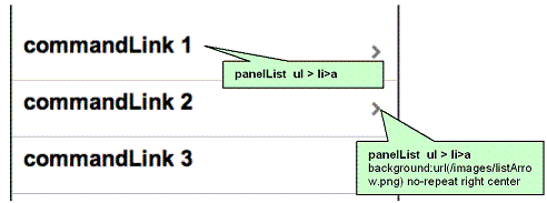
panelList ul
      .panelList ul {
        position: absolute !important;
        margin: 0 !important;
        padding: 0 !important;
        left: 0 !important;
        top : 45px !important;
        width: 100% !important;
        min-height: 372px !important;
      }

      panelList ul > li
      .panelList ul > li {
        position:relative !important;
        margin:0 !important;
        border-bottom:1px solid #E0E0E0 !important;
        padding:8px 0 8px 10px !important;
        list-style:none !important
      }

      panelList ul > li > a
      .panelList ul > li > a {
        display:block !important;
        margin:-8px 0 -8px -10px !important;
        padding:8px 32px 8px 10px !important;
        text-decoration:none !important;
        color:inherit !important;
        background:url(/images/listArrow.png) no-repeat right center !important;
        min-height:34px !important;
        font-size:20px;
        font-weight:bold;
      }
Table List
Table List Use the table list component for displaying a dynamic list of navigation items. This component provides built-in navigation since it is a table. Unlike Panel List, the table list component include style classes for including images and detailed descriptions below the navigation items.
      <tr:table value="#{bindings.EmployeesView15.collectionModel}"
                  var="row"
                  rows="7"
                  width="100%"
                  styleClass = "iphoneTable"
                  emptyText="#{bindings.EmployeesView15.viewable ? 'No rows yet.' :
                  id="mainTable" horizontalGridVisible="false" >

        <tr:column >
          <tr:panelGroupLayout layout="vertical" styleClass="listing">

            <tr:outputText value="#{row.bindings.PhoneNumber.inputValue}"
                                    styleClass="listingDetails"/>

            <tr:commandLink text="#{row.bindings.LastName.inputValue} ,
                                    #{row.bindings.FirstName.inputValue} ,
                                    styleClass="listingLink"
                                    partialSubmit="true"
                                    actionListener = "#{agentUtil.gotoPage2}"
                                    id="myLink1"
                                    disabled="#{!bindings.Execute.enabled}"
                                    onclick='iPhone.slideFragments("page2",
                                    "page1")'>
            </tr:commandLink>

            <tr:image styleClass="listingImage"
                          source="/images/326425649.png"/>
          </tr:panelGroupLayout>
        </tr:column>
      </tr:table>
To create a table list:
- Create a Trinidad read-only table using data control.
- Set the styleClass attribute for the table as iphoneTable. The expressions lsited in table below apply the needed iPhone-related CSS properties when you set the styleClass as iPhoneTable.
- Set the width of the table to 100.
- Set the horizontalGridVisible attribute to false.
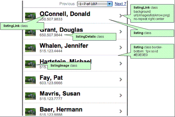
listing
      .listing {
        position: relative !important;
        margin: 0 !important;
        border-bottom: 1px solid #E0E0E0 !important;
        padding: 8px 0 8px 10px !important;
        font-size: 20px !important;
        font-weight: bold !important;
        list-style: none !important;
      }

      listingLink
      .listingLink {
        display: block !important;
        margin: -8px 0 -8px -10px !important;
        padding: 8px 32px 8px 10px !important;
        text-decoration: none !important;
        color: inherit !important;
        background: url(/images/listArrow.png) no-repeat right center !important ;
        padding-left: 54px !important;
        padding-right: 40px !important;
        min-height: 34px !important;
        font-size: 20px !important;
        font-weight: bold !important;
      }

      listingDetails
      .listingDetails {
        display: block !important;
        position: absolute !important;
        margin: 0 !important;
        left: 54px !important;
        top: 27px !important;
        text-align: left !important;
        font-size: 12px !important;
        font-weight: normal !important;
        color: #666666 !important;
        text-decoration: none !important;
        height: 13px !important;
        padding: 3px 0 0 0 !important;
      }

      listingImage
      .listingImage {
        display: block !important;
        position: absolute !important;
        margin: 0 !important;
        left: 6px !important;
        top: 7px !important;
        width: 35px !important;
        height: 27px !important;
        padding: 7px 0 10px 0 !important;
      }
Field Set
On the destination page, this component displays the detail of an item selected in panel navigation.
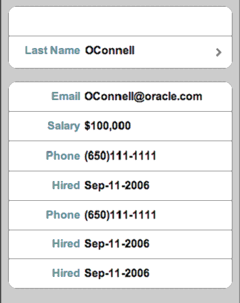
The Destination Page - Field Set component contains one or more rows where each row contains a label or a message (which can be simple text or another navigation item). As illustrated in the example below, you use the <div> tags to create these rows. The <div> tags are subelements of a <tr:panelCaptionGroup> tag.
Creating a Field Set
      <div class="panelBase">
        <tr:panelCaptionGroup>
          <div class="row">
            <tr:outputText styleClass="labeltext" value="#{agentUtil.name}"
              truncateAt="0"/>
            <tr:outputText styleClass="messageText"
              value="#{sessionScope.FirstName}" />
          </div>
          <div class="row">
            <tr:outputText styleClass="labeltext" value="Last Name"/>
            <tr:commandLink text="#{sessionScope.LastName}"
                            styleClass="messageLink"
                            partialSubmit="true"
                            id="myLink2"
                            actionListener="#{agentUtil.gotoPage3}"
                            onclick='iPhone.slideFragments("page3",
                            "page2");'
            />
          </div>
        </tr:panelCaptionGroup>
        <tr:panelCaptionGroup>
          <div class="row">
            <tr:outputText styleClass="labeltext" value="Email"/>
            <tr:outputText styleClass="messageText"
            value="#{bindings.LastName}@oracle.com"/>
          </div>
          <div class="row">
            <tr:outputText styleClass="labeltext" value="Salary"/>
            <tr:outputText styleClass="messageText" }"
                  value="#{sessionScope.Salary}"/>
          </div>
          <div class="row">
            <tr:outputText styleClass="labeltext" value="Phone"
                  truncateAt="5"/>
            <tr:outputText styleClass="messageText"
                  value="#{sessionScope.PhoneId}"/>
          </div>
          <div class="row">
            <tr:outputText styleClass="labeltext" value="Hired"
                  truncateAt="7"/>
            <tr:outputText styleClass="messageText"
                  value="#{sessionScope.HireDate}"/>
          </div>
          <div class="row">
            <tr:outputText styleClass="labeltext" value="Hired"
                  truncateAt="7"/>
            <tr:outputText styleClass="messageText"
                  value="#{sessionScope.HireDate}"/>
          </div>
        </tr:panelCaptionGroup>
      </div>
How to Create Field Set Components To create this component:
- Insert as many <div> tags as needed within a <tr:panelCaptionGroup> tag.
-
To create rows, define each <div> tag with the row class attribute. For example:
The row attribute sets the position, height, and border for each row.
<div class="row"> -
Within each <div> tag, create a label element as follows:
- Create a <tr:outputText> tag.
- To set the position, width, font, and color or the label element, define the StyleClass as labeltext.
<tr:outputText styleClass="labeltext" value="Phone" truncateAt="5"/> -
Create a message element using one of the following:
-
The <tr:outputText> tag with styleClass set as messageText.
For example:
The messageText style class sets the position, width, font, and color for the label element.
<tr:outputText styleClass="messageText" value="#{sessionScope.PhoneId}"/> -
The <tr:commandLink> tag with styleClass set as messageLink. For example:
The messageLink element sets the position, width, font, height, and color for the message element.
        <tr:commandLink text="#{sessionScope.LastName}"
                                styleClass="messageLink"
                                partialSubmit="true"
                                id="myLink2"
                                actionListener="#{agentUtil.gotoPage3}"
                                onclick='iPhone.slideFragments("page3", "page2");'
                                />
-
The <tr:outputText> tag with styleClass set as messageText.
For example:
-
For a panel base background, wrap the <div> tags with the panelBase class
attribute.
Note: The panelBase fieldset sets rounded edges. The fieldset element is added by the renderer for the <tr:panelCaptionGroup> element.
Field Set Style Classes This section lists the style classes for field set components and their layout properties.
labeltext
      .labeltext {
        position: absolute !important;
        margin: 0 0 0 14px !important;
        line-height: 42px !important;
        font-weight: bold !important;
        color: #7388a5 !important;
        text-align: right !important;
        width: 90px !important;
        white-space: nowrap !important;
      }

      messageText
      .messageText {
        display: block !important;
        margin: 0 !important;
        border: none !important;
        padding: 12px 10px 0 110px !important;
        text-align: left !important;
        font-weight: bold !important;
        text-decoration: inherit !important;
        height: 42px !important;
        color: inherit !important;
        box-sizing: border-box !important;
        -webkit-box-sizing: border-box !important;
      }

      messageLink
      .messageLink {
        display: block !important;
        text-align: left !important;
        text-decoration: none !important;
        color: inherit !important;
        background: url(/images/listArrow.png) no-repeat right center !important ;
        padding-top: 12px !important;
        padding-left: 111px !important;
        padding-right: 40px !important;
        min-height: 34px !important;
        font-size: 16px !important;
        font-weight: bold !important;
      }

      panelBase
      .panelBase {
        box-sizing: border-box !important;
        -webkit-box-sizing: border-box !important;
        padding: 10px !important;
        background: #c8c8c8 url(/images/pinstripes.png) !important;
      }

      panelBase fieldset
      .panelBase fieldset {
        position: relative;
        margin: 0 0 20px 0;
        padding: 0;
        background: #FFFFFF;
        -webkit-border-radius: 10px;
        border: 1px solid #999999;
        text-align: right;
        font-size: 16px;
      }

      row
      .row {
        position: relative !important;
        min-height: 42px !important;
        border-top: 1px solid #999999 !important;
        -webkit-border-radius: 0 !important;
        text-align: right !important;
      }

      row:first-child
      .row:first-child {
        border-top: none !important;
      }